Overview
Problem: IBM needed to launch a new AI-powered product with a brand that stood out from its wider suite, while remaining consistent with their global identity. The user experience had to be simple and human-centric to encourage engagement from non-technical users.
Outcome: We delivered a unique and friendly brand identity with bright, energetic colours and playful illustrations. The product landing page was clear and informative, helping users quickly understand what Watson Orchestrate could do and why it mattered.
The Challenge
The main challenge was balancing IBM’s trusted, enterprise-level image with a fresh, approachable design for a cutting-edge product. We had to define visual and verbal styles that stood out from other IBM products, while still feeling like part of the family.
Our Goals
- Create a visually distinctive brand identity within IBM’s design system
- Design a welcoming, user-focused product landing page
- Craft UX copy and microinteractions that made the AI feel intuitive and helpful
- Drive awareness and adoption by clearly explaining value to a broad audience
What we Did
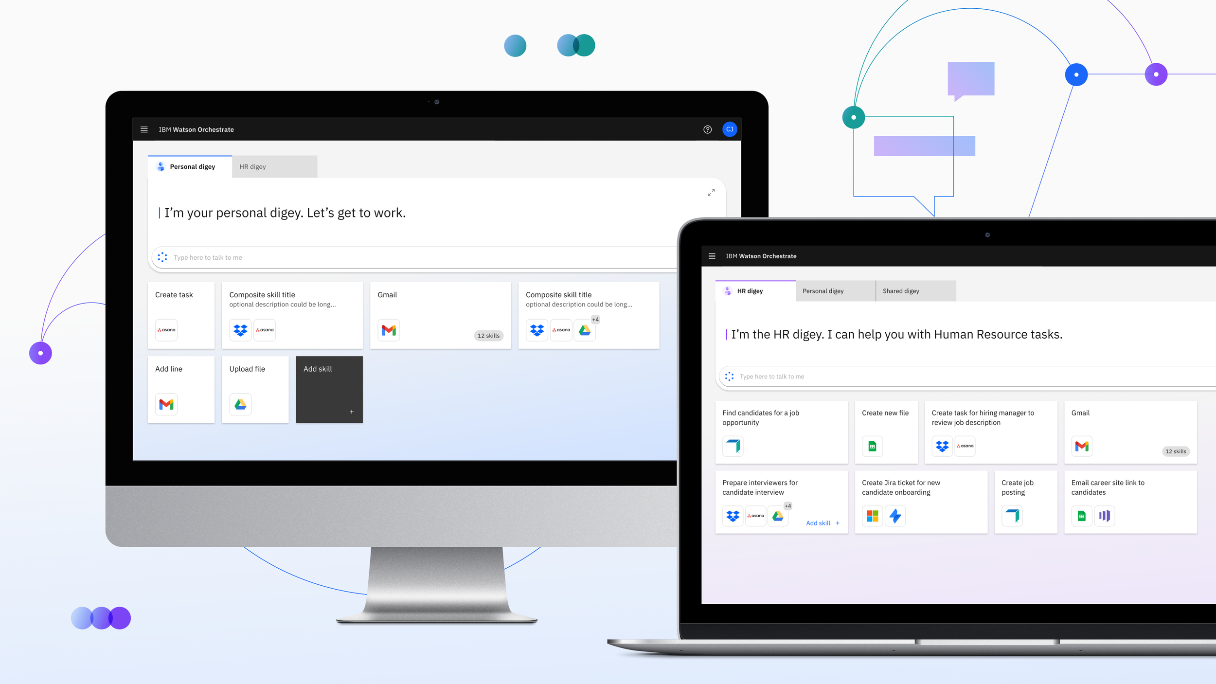
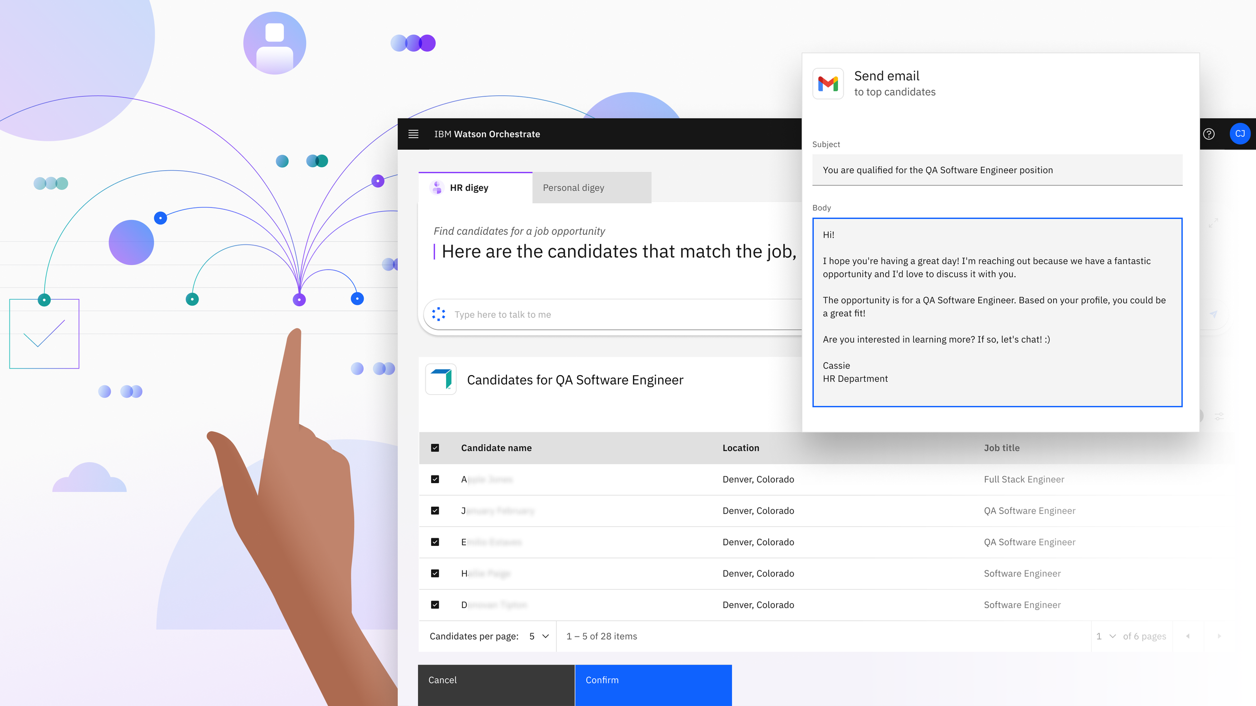
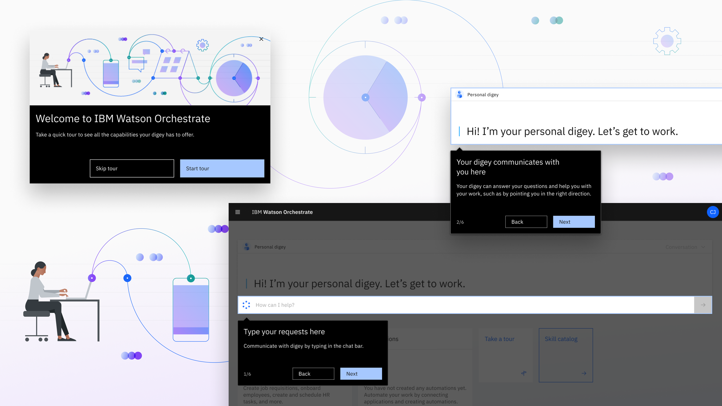
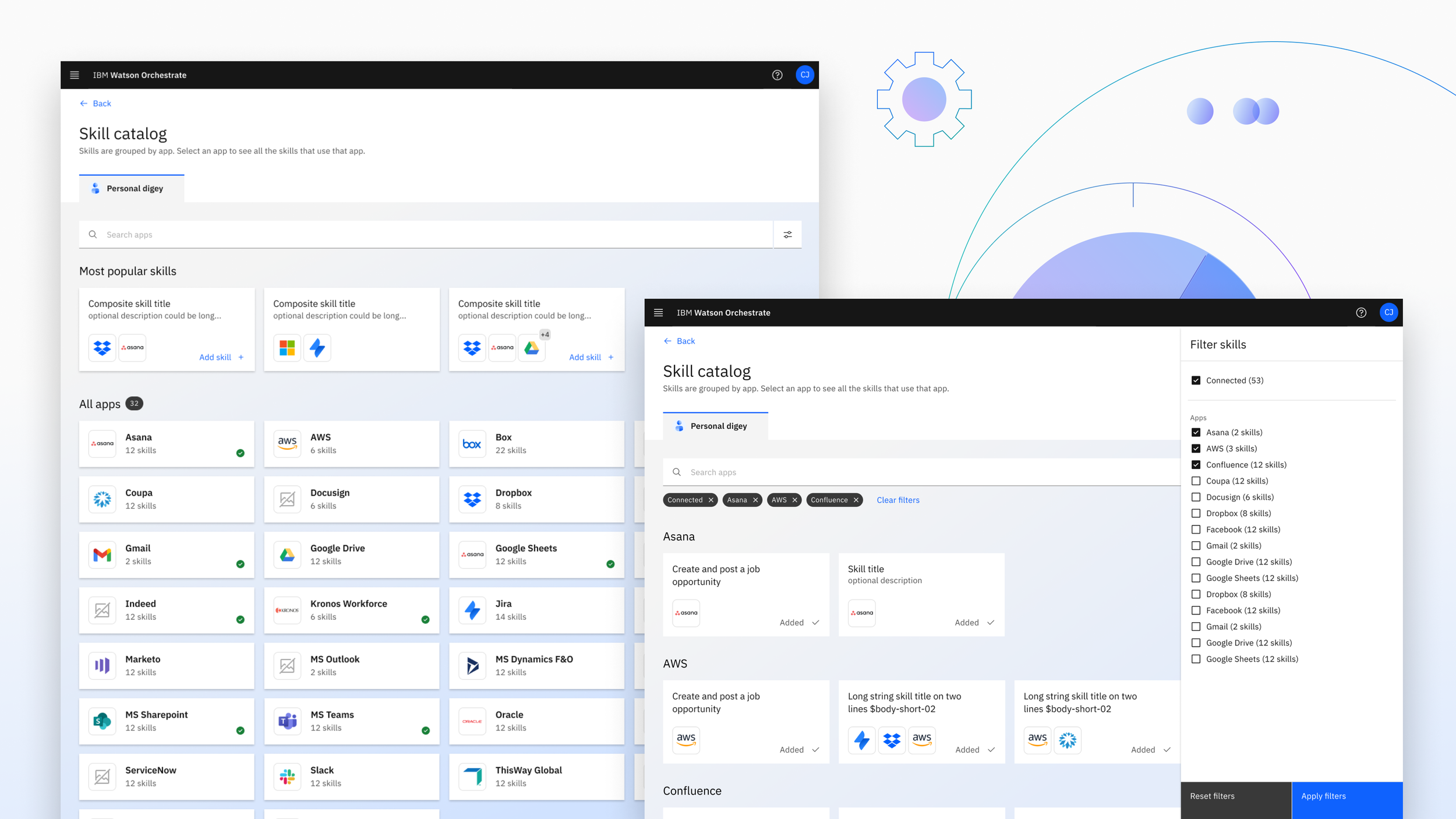
1. Brand Identity
We developed a colour palette, typography, and illustration style that felt bold and modern while still trustworthy. The colourful illustrations and custom icons brought warmth and personality to the product.
2. UX and Web Design
We designed a product landing page that guided users through what Watson Orchestrate is, how it works, and how to get started.
Outcomes
- Distinct brand identity helped Watson Orchestrate stand out from IBM’s other products
- The landing page supported a successful product launch and improved user understanding
- Stakeholders praised the clarity and friendliness of both visuals and copy
Reflections
Designing for AI means designing for trust. This project taught me how important it is to humanise emerging tech, especially for non-technical users. We needed Watson Orchestrate to feel smart, but not intimidating. I'm proud of how the final experience balanced playfulness and professionalism.