Project Overview
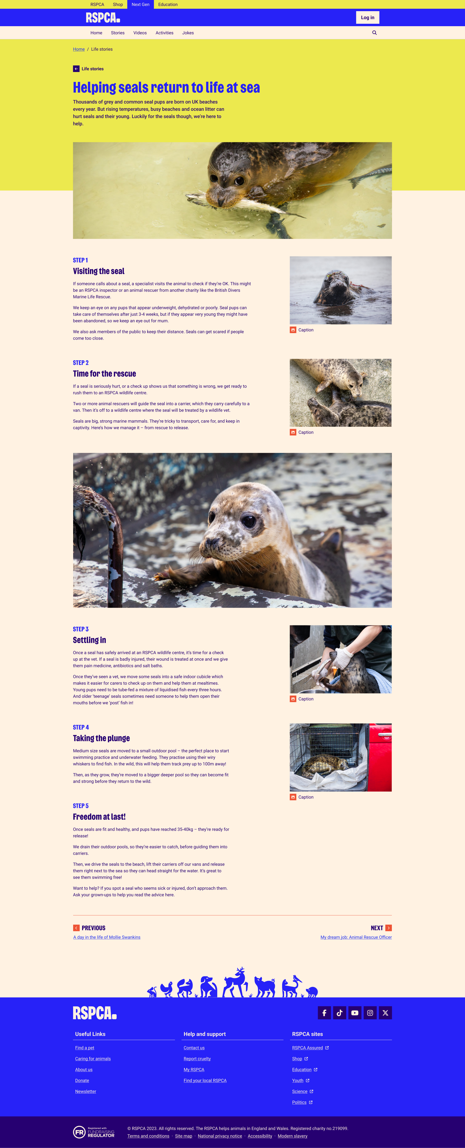
NextGen is the new youth website from the RSPCA. As the Product Owner, I spearheaded the initiative from start to finish,
leading the project by designing and conducting workshops, performing in-depth research and interviewing
kids and parents. These efforts culminated in the development of a website tailored to a young audience,
engaging and educating the next generation about animal welfare.
Research
We conducted a qualitative study to gather insights into the user experience of the new RSPCA Youth Site.
The research involved online sessions with children aged 6 to 12 to understand their interaction with the
site. Our research was comprised of three main parts:
- Pre-Session Questionnaire: Captured initial knowledge, preferences, and online
behaviour.
- Scenario-Based Tasks: Guided through navigation and content exploration tasks,
sharing thoughts aloud.
- Post-Task Interviews: Delved deeper into experiences, preferences and challenges
encountered.
Objectives
- Evaluate the user experience among children aged 6 to 12
- Understand navigation, content interaction and site perception
- Identify improvement areas and enhance site appeal and functionality
Key Insights
- Clear categorisation and engaging content are essential.
- Emphasis on interactive elements such as games and videos.
- Positive feedback on design and navigation.
Recommendations
- Continue diversifying content to maintain engagement.
- Introduce more interactive elements like quizzes and polls.
- Establish a feedback loop for continuous improvement.
Users and User Stories
To ensure that the RSPCA NextGen website met the needs of all its users, I developed a detailed User
Story Catalogue. This allowed me to identify key user requirements and structure the development process
around the real needs of children, parents, content creators and administrators. Below is an overview of
the primary users and some key user stories that guided our development.

Children (Aged 6-12)
As the main audience of the site, children need a platform that is engaging, easy to navigate and full of interactive content.
- User Story: "As a child, I want to be able to navigate to each page on the website without help so that I can find information on my own."
- Acceptance Criteria: When a child accesses the navigation bar, they should be able to easily find and access different pages such as Home, Games, Activities, Profile, Stories and Videos.

Parents
Parents oversee their children's activities and manage content and communication preferences on the platform, ensuring that the content is suitable for their child.
- User Story: "As a parent, I want to sign up my child with my email and their details so that my child can access the right content and save their progress."
- Acceptance Criteria: The parent should be able to sign up their child using their email and set up a profile for them that allows progress to be saved.
.png)
Content Creators
Content creators are responsible for generating, updating and tagging content that aligns with RSPCA’s mission and is appropriate for the target audience.
- User Story: "As a content creator, I want to access templates so that I can create content in the correct format."
- Acceptance Criteria: The content creator should have access to predefined templates in Liferay to create and format content before review and publication.

Super Admins
Super admins manage permissions, content visibility and ensure that the website remains up-to-date and secure.
- User Story: "As a super admin, I want the ability to put some content behind a login wall so that parents can limit their child to certain content."
- Acceptance Criteria: The super admin should be able to tag content to be behind a login wall, making it accessible only to users who are logged in.
Build and Development
The RSPCA NextGen site was built using Liferay CMS. The development process involved several key phases:
1. Collaboration and Planning
I worked closely with the content team, brand representatives and IT department to ensure the site aligned
with RSPCA's mission and brand guidelines. This collaboration helped define the site’s objectives and ensure
that all requirements were met.
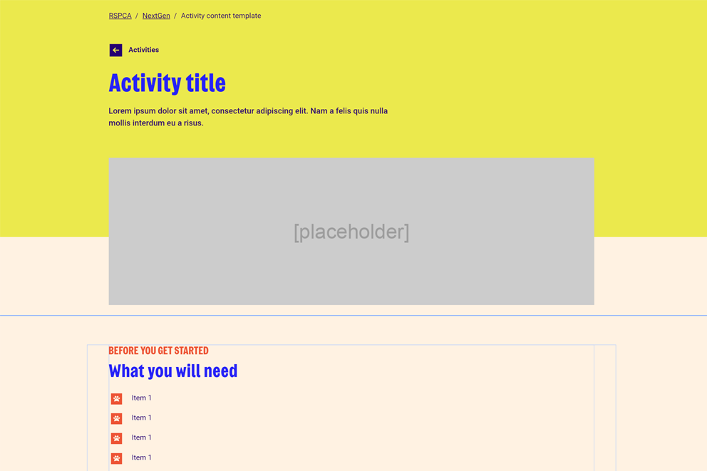
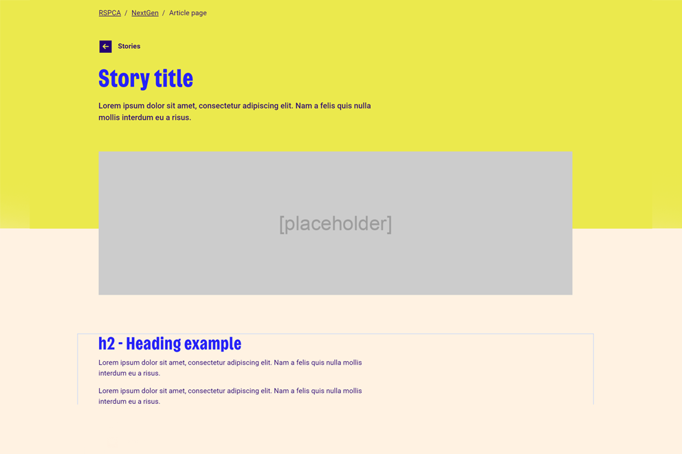
2. Template Creation
To facilitate easy content management, I developed customisable templates within Liferay. These templates
allow content creators to efficiently add and update content while maintaining consistency in design and
functionality across the site.
3. Layout and Design
Leveraging Liferay’s design system, I created engaging and user-friendly layouts. The site features
interactive elements tailored to the needs of its young audience, including jokes and stories. The design
emphasises ease of navigation and visual appeal to ensure a positive user experience for both children and
parents.
3. Implementation and Testing
After building the core functionalities and integrating the templates, I conducted thorough testing to ensure
the site performed well across various devices and browsers. Feedback from initial testing phases helped and
address any issues before the final launch.
The result is a vibrant, interactive website that supports RSPCA’s mission to educate and engage its
audience. The site has been well-received by children and parents alike, as evidenced by the 76% engagement rate, reflecting the successful
implementation of the project’s goals.
Final UI and Ongoing Management
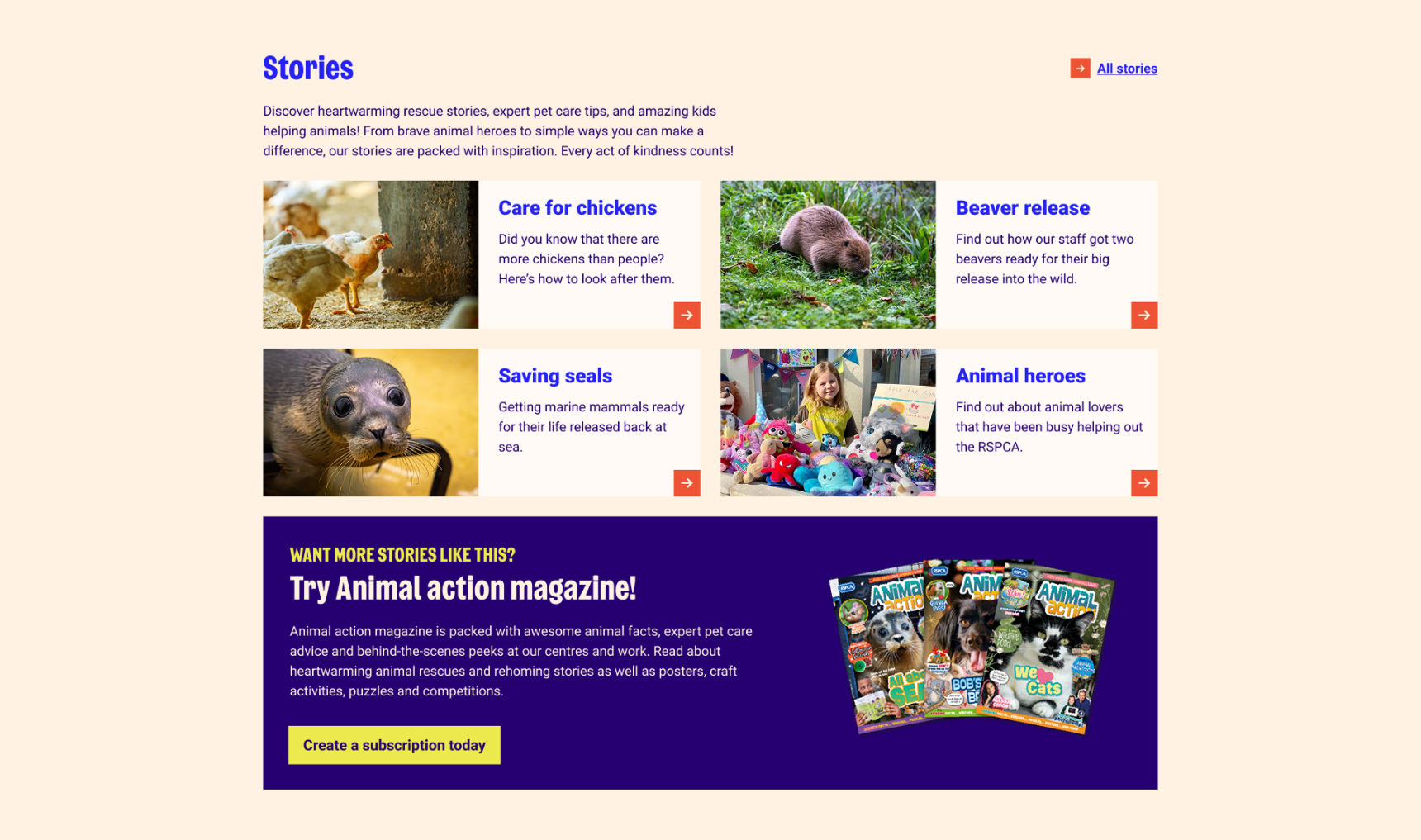
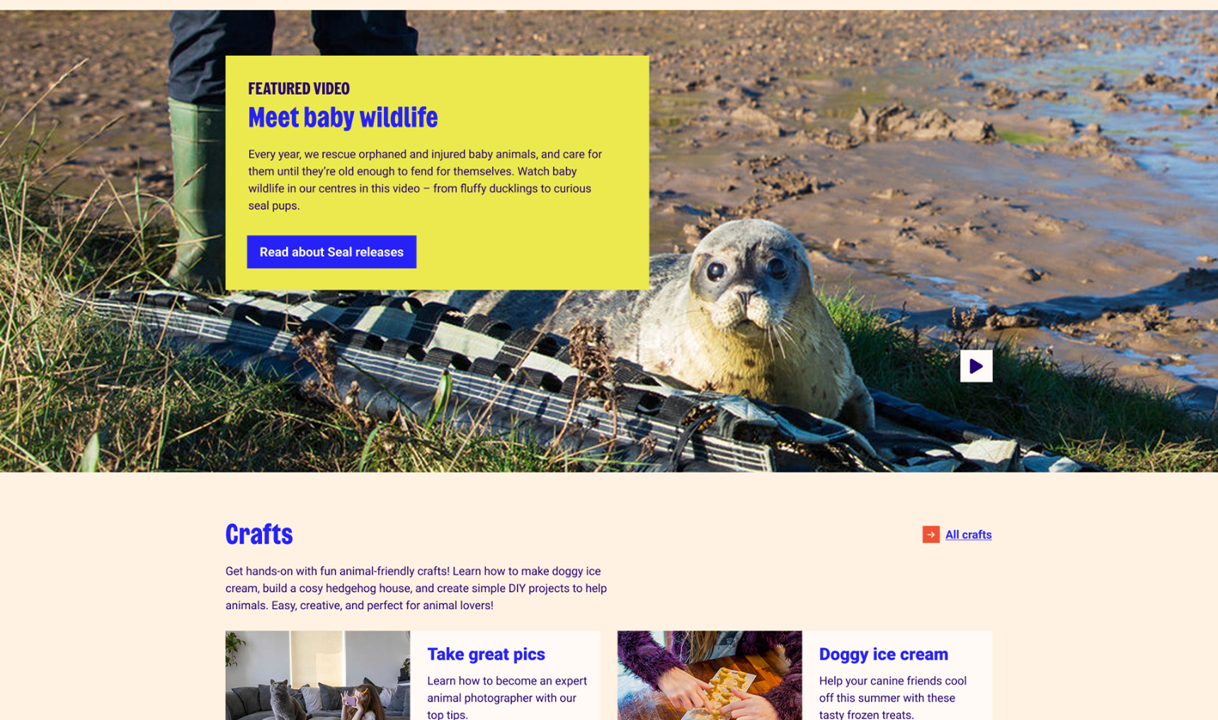
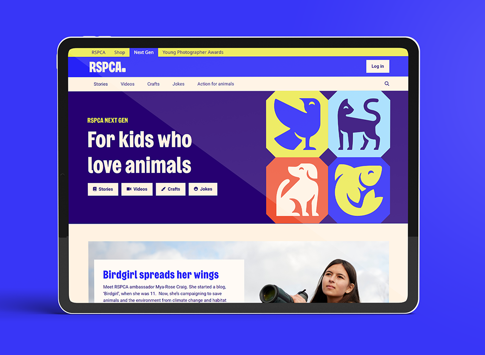
The final RSPCA NextGen site presents a vibrant and engaging user interface designed to captivate and educate
its young audience. The site’s UI integrates a range of interactive elements and visually appealing layouts
that align with RSPCA’s mission and branding.
User Interface Highlights
The website's design emphasises ease of use and accessibility, ensuring that children can navigate through
content intuitively. Key features include:
- Interactive Elements: Polls designed to engage children and make learning about animal
welfare fun.
- Dynamic Layouts: Responsive and visually appealing layouts that adjust seamlessly across
various devices, providing a consistent experience for users.
- Content Variety: A mix of educational and fun stories, videos and interactive components
to keep the content fresh and engaging.
Content Management and Updates
To keep the site relevant and engaging, we have established a detailed content management plan:
- Weekly Updates: Jokes are refreshed every week to ensure there is always new, entertaining
content for users.
- Quarterly Updates: Stories and other significant content are reviewed and updated every
quarter, providing fresh and relevant material that aligns with educational goals and current events.
Innovation and Future Enhancements
We are committed to continually enhancing the site by introducing new features and improvements. Recent
innovations include:
- Joke Component: A new interactive feature allowing users to enjoy jokes, which fosters
engagement and interaction.
Regular updates and the addition of new features are key to maintaining user interest and ensuring that the
site continues to meet the evolving needs of its audience.



.png)
