Overview
Problem: The Phoenix magazine lacked a consistent design language, and the editorial process needed a more streamlined and cohesive visual direction.
Outcome: By redesigning the layout and establishing a consistent visual theme, I was able to enhance the overall readability and aesthetic, allowing the stories to shine and the school’s identity to come through clearly.
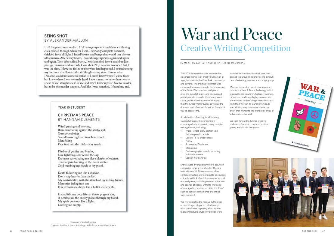
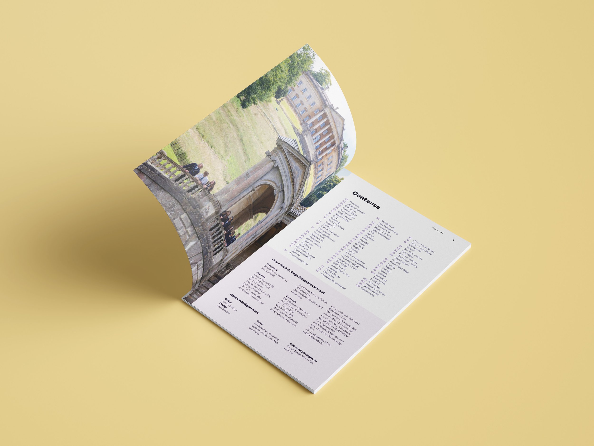
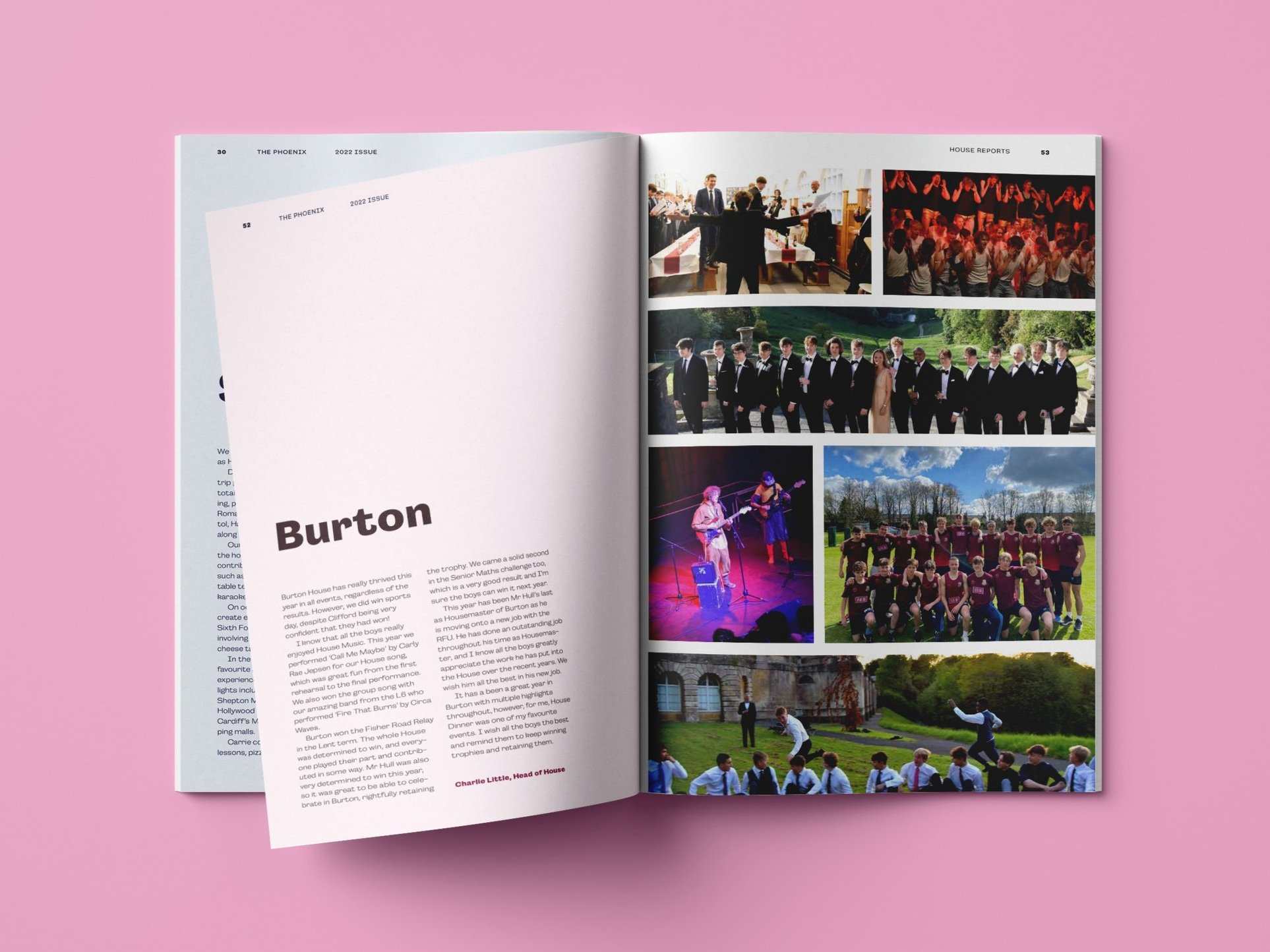
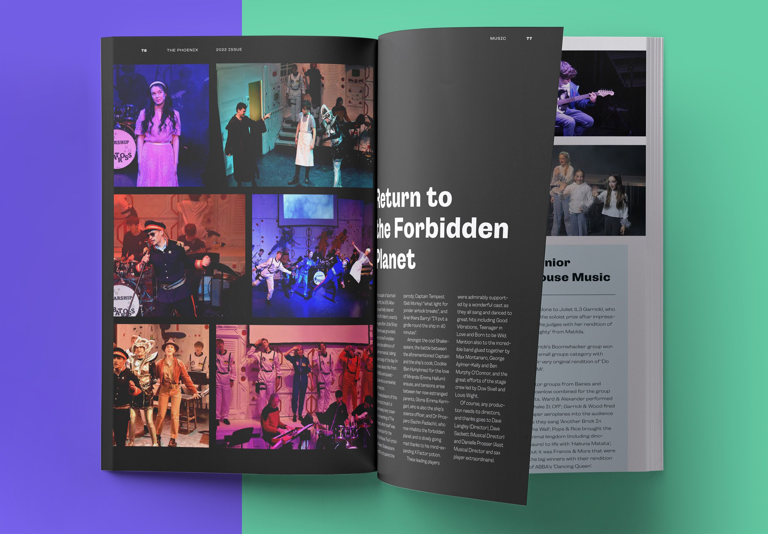
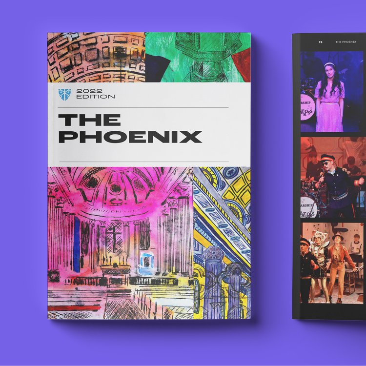
Before
After
The Challenge
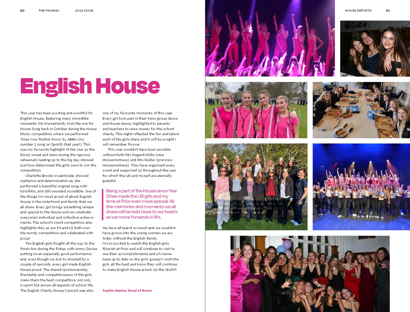
The magazine had been using outdated layouts, and the lack of consistency across pages made it difficult to maintain a cohesive visual identity. Additionally, there was a need to better highlight student stories and important milestones in a way that aligned with the school’s overall branding.
My Goals
- Establish a consistent design system that reflects the school's identity
- Improve readability and visual hierarchy for better storytelling
- Highlight academic achievements and student contributions
- Create a flexible layout that works for varying content types
What I Did
1. Established a Visual Theme
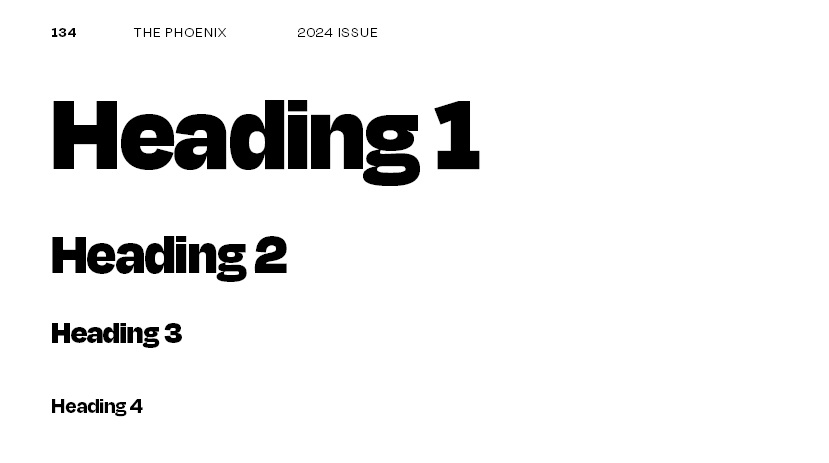
I worked closely with the client to establish a cohesive visual theme that reflected the school’s values while allowing the content to be the main focus. I chose typography, color schemes, and imagery that aligned with the school's brand, while keeping a modern and fresh vibe that would appeal to students and parents.
2. Designed a Consistent Layout
I created a flexible grid system that worked across the magazine’s varying content types—articles, student features, photography spreads, and academic highlights. This ensured every section felt unified while still allowing for unique content presentation.
3. Focused on Readability
I adjusted font sizes, line spacing, and color contrasts to enhance readability, especially for articles with long blocks of text. This allowed students and alumni to easily engage with the stories while enjoying a visually appealing experience.
Outcomes
- I created a cohesive magazine that was modern, cool and aligned with the Prior Park aesthetic.
- The magazine’s readability was significantly improved, making it easier to engage with content
- Students and faculty loved the new design, with positive feedback regarding the fresh, modern layout
Reflections
Editorial design is about layering functionality and style. By focusing on visual consistency and readability, I created a strong base for the stories to come to life, while allowing the individuality and personality of the students shine.
Although it was a challenging process (as a 200 page magazine!), the results are always more than worth it. It’s rewarding to see the positive feedback and how the magazine has grown into a valuable piece of the school’s history.

.jpg)